SOIN MED
A brand identity designed to reflect a more conscious and elevated approach to aesthetic care.
Sector : Wellness & Aesthetic Clinic (French Mediterranean coast)
Services : Brand strategy, visual identity (logo suite, colour palette, typography, textures), packaging, website design.
Soin Med was preparing for its launch, with a clear ambition: to position itself as a high-end wellness and aesthetic clinic, aligned with the quality of its services and expertise.
But beyond that, they wanted to create something that truly felt like them — far from the cold, overly clinical image often associated with the industry.
They needed a brand that would feel both premium and approachable, while standing out in a saturated market. A brand capable of translating not just what they do, but how they care.
They were looking to create an identity that could:
reflect their holistic vision of care
capture a Mediterranean sense of balance and lifestyle
build trust and credibility from the very first impression


The main objective was to build a strong and cohesive brand foundation before launch, while establishing a clear and recognisable positioning in a competitive market. The project also aimed to develop a visual identity system capable of evolving seamlessly across all touchpoints, from print to packaging and digital, while ensuring consistency, clarity, and professionalism throughout.
To bring this vision to life, I developed a strategic and detail-driven approach:
Brand Strategy
We explored the foundations of Soin Med, its values, positioning, and what truly sets it apart, to build a clear and intentional direction from the start.
Positioning & competitor analysis
I analysed the existing landscape to identify opportunities for differentiation and ensure the brand would stand out while remaining aligned with its market.
Visual identity design
I created a complete and cohesive identity system, including logo suite, colour palette, typography, and textures, designed to reflect both elegance and approachability.
Brand extensions & applications
The identity was then applied across key touchpoints, including packaging and initial website design, ensuring consistency and a strong, recognisable presence.


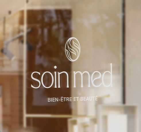
The primary logo combines a custom logotype with an organic symbol, designed as a subtle nod to nature and well-being.
Its flowing curves draw inspiration from leaves, the gentle movement of the sea, and the balance of yin and yang, reating a sense of harmony and continuity.
The custom typography mirrors this softness, with rounded, fluid letterforms, particularly visible in the n and e , echoing the motion of waves.
A clean sans serif tagline brings contrast, adding structure and clarity to the overall composition.
Used throughout the identity, the logomark becomes a recognisable thread, reinforcing the brand’s presence across every touchpoint.